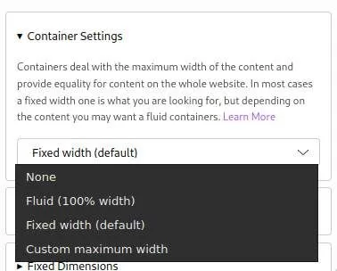
Container Types in Mame
You can set the container width for each section individually. The default is a fixed container (max-width: 1280px) which centers the content in the middle of the screen. It adds dynamic padding and margin on the left and right depending on the screen size.
- None: No container is added to the section at all
- Fluid: The container is set to 100% width all the time.
- Fixed Width: The default one, as explained above.
- Custom Maximum Width: Just like the default one, but you can set the maximum width yourself.
The container does not affect background images or videos of the section. These are always 100% width. Use Element backgrounds (for example of a Grid) if you want an background in the width of the container.