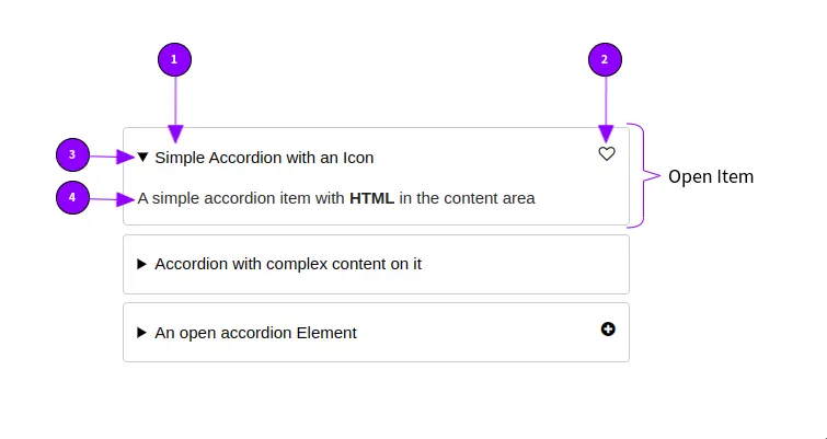
Accordion Element

Display Text in a condensed manner.

Overview

The Accordion Element is used to display text or other content in a condensed manner. You can save space with it and make your content clearer. Accordions work well for for smaller screens too, as they reduce the amount of vertical scrolling required.

However it hides content from the user, so make sure you have a descriptive title.

Usage Examples

  • Large Text blocks, which are not all relevant for the User.
  • Questionnaires where the user should be able to look for an answer quickly (Frequently asked questions).
  • Organizing related information.
  • Can be an alternative to anchor links (Within page links)
  • Long wizards and checkouts

Properties

  1. Accordion Title: The title is always visible as header, even in collapsed form. The user clicks on the title to expand the content. It should be clear and descriptive and as brief as possible.
  2. Accordion Icon: You can choose an icon which is displayed on the side of the accordion element. Don't be confused with the accordion collapse status on the left. 
  3. Is Open: Should the accordion item be collapsed (closed) or expanded (open).
  4. Accordion Content: You add the content directly on the accordion element, open it if necessary. You can add any other element, including grids to an accordion. (You can even have another accordion in it).
Everything else can be configured with the general properties. 
Accordion Element Wireframe

See it in action

Simple Accordion with an Icon
A simple accordion item with HTML in the content area
An open accordion Element

Interactions and Accessibility

Users can expand the accordion by clicking on the header with the accordion title. As an alternative users can use the keyboard and navigate between Accordions by pressing Tab and open them by pressing Enter

Generated HTML


<details>
   <summary>Accordion Title<span class="icon icon-heart-o" style="--ft:right;"></span></summary>
   <div>
     Content goes here
   </div>
</details>

Style / CSS Selectors


.mame-accordion {
  /* The whole Accordion Element */
}

details {
  /* Styles the whole Accordion Item */

details summary {
  /* Styles the header element */
}

Read more in the bonsai.css documention

JavaScript

Accordions are implemented in plain HTML 5 and CSS 3. They don't need any JavaScript to work properly.

Was this article helpful?