Buttons are used for interactions with the user. In Mame except from forms they are mostly used as more visible link replacement. They have two color types, background and text color.
Usage Examples
Call to Action (e.g. Contact us, Buy now..).
Form Interactions (Submit forms, Login..).
Highlighting content
Properties
Shared Properties
Display as Group: If you have multiple buttons you can display them as group, which removed the margin between them.
Button Properties
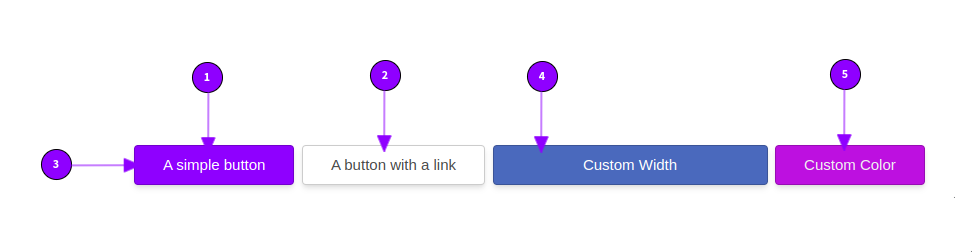
Button Text: Text displayed on the button
Link Type: Should the button link to another page or different website? If yes is it an internal website link or an external site.
Button Size: Set the size of the button. Default is 100.
Fixed Width: Set a custom size (text is centered) for the button. If you want to reset it, just set the value to zero (auto).
Button Color Style: Set the color of the button. You can choose between your sites default colors or set a custom background and text color.
Everything else can be configured with the general properties.