Grid Element

Columns and responsive content.

Overview

The Grid Element is offering a two dimensional grid-based layout systems with rows and columns. These help positioning and aligning your content. A Grid Element is only a container, you add other elements onto it. You can even have a Grid element in a Grid to create even the most complex designs. Or use a grid to have two slideshows next to each other. Grids are totally flexible and offer you an easy way to create responsive and awesome content.

The grid system of Mame allows for more flexibility then for example the 12 column system of Bootstrap, but basically is working the same way (Bootstrap uses Grid too).

Usage Examples

  • Elements next to each another (horizontally).
  • A text on the left and another text on the right side. (Like on this Grid here).
  • Table-like content.
  • Multiple content elements in another element, like an accordion.
  • Sidebars / Aside content
  • As an alternative to flexbox (you can set use the section advanced settings for flex)

Grid Properties

  1. Column Count (Default): If you don't set up responsive columns, this is the default count of it. If you use responsive grid column settings, this is also used for devices smaller then the minimum grid-size (small - 640px)!
  2. Grid Gap: Set the spacing between the columns (horizontal and vertical). 
  3. Grid Column width distribution: Choose how the column width should be calculated.
  4. Even: Same space for every column
    Auto: Automatically space columns based on the content.
    Custom: Set the spacing for yourself. Like 1fr 1fr 1fr to have three columns with equal width. Check the HTML 5 grid documentation for a guide. 
  5. Align Items: Vertical alignment of the items (if they have different heights).
  6. Justify Content: Horizontal alignment of the items (if you use equal or custom column width and the item is smaller then the column).
  7. Responsive Overrides (Column count)
    Small Devices: Column count for small devices (640px to 767px).
    Medium Devices: 768px to 1023px
    Large Devices: 1024px to 1279px
    Extra Large Devices: >= 1280px
Everything else can be configured with the shared general properties, like backgrounds, spacing.. 
Grid Explanation Wireframe

See it in action

Grid Column 1
Grid Column 2
Grid Column 3
A Grid Element with six Elements in total. Three Formatted Text Elements in the first row. And three different sized Icon Elements in the second one.

Generated HTML (Outline)


<div class="mame-grid-control" role="grid">
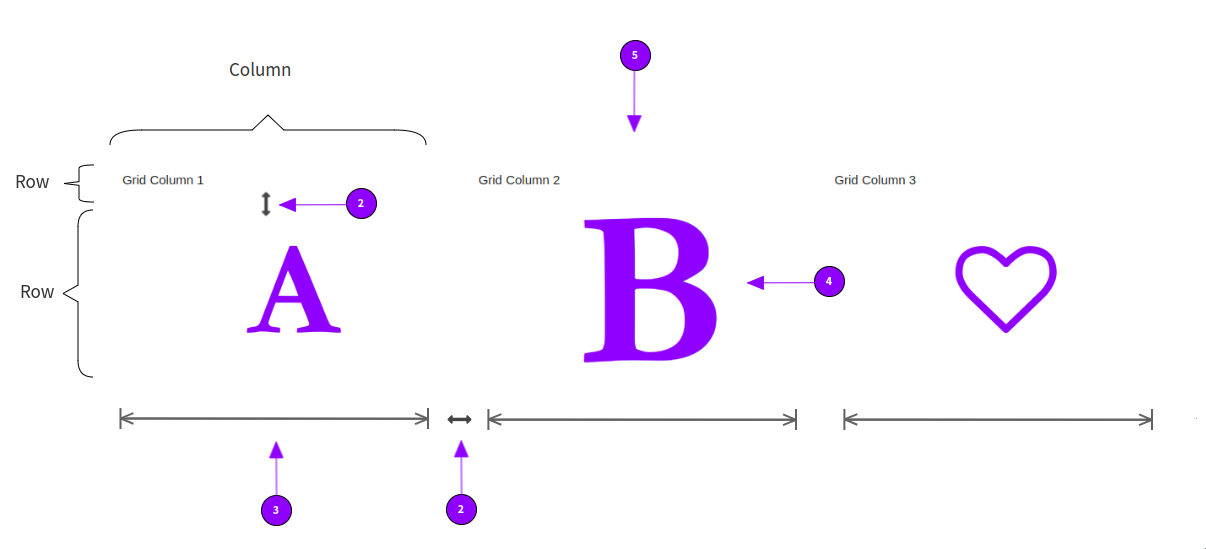
<div class="mame-element mame-grid" style="--d:grid; --gtc:1fr; --gtc-sm:1fr; --gtc-md:1fr 1fr; --gtc-lg:1fr 1fr 1fr; --gtc-xl:1fr 1fr 1fr; --gg:15px; --jc:space-between; --ai:center;" role="row">
   <div class="mame-element" role="gridcell">Grid Column 1</div>
   <div class="mame-element" role="gridcell">Grid Column 2</div>
   <div class="mame-element" role="gridcell">Grid Column 3</div>
</div>
</div>

Style / CSS Selectors


.mame-grid {
  /* All grid elements */
}

Read more in the bonsai.css documentation.

JavaScript

Grids are implemented in plain HTML 5 and CSS 3. They don't need any JavaScript to work properly.

Was this article helpful?